
Using Dropdown plugin you can add dropdown menus to any components like navbars, tabs, pills and buttons.
The following example demonstrates the usage of dropdown menu within a navbar −
 Within Tabs
The following example demonstrates the usage of dropdown menu within tabs −
If you want to include this plugin functionality individually, then you will need dropdown.js. Else, as mentioned in the chapter Bootstrap Plugins Overview, you can include bootstrap.js or the minified bootstrap.min.js.
Usage
You can toggle the dropdown plugin's hidden content −- Via data attributes − Add data-toggle = "dropdown" to a link or button to toggle a dropdown as shown below −
<div class = "dropdown">
   <a data-toggle = "dropdown" href = "#">Dropdown trigger</a>

   <ul class = "dropdown-menu" role = "menu" aria-labelledby = "dLabel">
      ...
   </ul>

</div>
- If you need to keep links intact (which is useful if the browser is not enabling JavaScript), use the data-target attribute instead of href = "#"−
<div class = "dropdown">
   <a id = "dLabel" role = "button" data-toggle = "dropdown" data-target = "#" href = "/page.html">
      Dropdown
      <span class = "caret"></span>
   </a>

   <ul class = "dropdown-menu" role = "menu" aria-labelledby = "dLabel">
      ...
   </ul>

</div>
- Via JavaScript − To call the dropdown toggle via JavaScript, use the following method −
$('.dropdown-toggle').dropdown()
Example
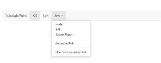
Within NavbarThe following example demonstrates the usage of dropdown menu within a navbar −
<nav class = "navbar navbar-default" role = "navigation">

   <div class = "navbar-header">
      <a class = "navbar-brand" href = "#">TutorialsPoint</a>
   </div>

   <div>
      <ul class = "nav navbar-nav">
         <li class = "active"><a href = "#">iOS</a></li>
         <li><a href = "#">SVN</a></li>

         <li class = "dropdown">
            <a href = "#" class = "dropdown-toggle" data-toggle = "dropdown">
               Java
               <b class="caret"></b>
            </a>

            <ul class = "dropdown-menu">
               <li><a href = "#">jmeter</a></li>
               <li><a href = "#">EJB</a></li>
               <li><a href = "#">Jasper Report</a></li>

               <li class = "divider"></li>
               <li><a href = "#">Separated link</a></li>

               <li class = "divider"></li>
               <li><a href = "#">One more separated link</a></li>
            </ul>

         </li>
      </ul>
   </div>

</nav>
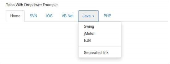
Within TabsThe following example demonstrates the usage of dropdown menu within tabs −
<p>Tabs With Dropdown Example</p>

<ul class = "nav nav-tabs">
   <li class = "active"><a href = "#">Home</a></li>
   <li><a href = "#">SVN</a></li>
   <li><a href = "#">iOS</a></li>
   <li><a href = "#">VB.Net</a></li>

   <li class = "dropdown">
      <a class = "dropdown-toggle" data-toggle = "dropdown" href = "#">
         Java
         <span class = "caret"></span>
      </a>

      <ul class = "dropdown-menu">
         <li><a href = "#">Swing</a></li>
         <li><a href = "#">jMeter</a></li>
         <li><a href = "#">EJB</a></li>

         <li class = "divider"></li>
         <li><a href = "#">Separated link</a></li>
      </ul>

   </li>

   <li><a href = "#">PHP</a></li>
</ul>
Options
There are no options.Methods
The dropdown toggle has a simple method to show or hide the dropdown.$().dropdown('toggle')
Example
The following example demonstrates the usage of dropdown plugin method.<nav class = "navbar navbar-default" role = "navigation"> <div class = "navbar-header"> <a class = "navbar-brand" href = "#">TutorialsPoint</a> </div> <div id = "myexample"> <ul class = "nav navbar-nav"> <li class = "active"><a href = "#">iOS</a></li> <li><a href = "#">SVN</a></li> <li class = "dropdown"> <a href = "#" class = "dropdown-toggle">Java <b class = "caret"></b></a> <ul class = "dropdown-menu"> <li><a id = "action-1" href = "#">jmeter</a></li> <li><a href = "#">EJB</a></li> <li><a href = "#">Jasper Report</a></li> <li class = "divider"></li> <li><a href = "#">Separated link</a></li> <li class = "divider"></li> <li><a href = "#">One more separated link</a></li> </ul> </li> </ul> </div> </nav> <script> $(function(){ $(".dropdown-toggle").dropdown('toggle'); }); </script>
No comments:
Post a Comment