Why Use Landing Pages?
A landing page is a detailed page with multiple links. It performs the following roles −- Adds more explanation beyond your email copy.
- Showcases your products.
- Gives your recipients tip lists.
- Draws the recipients to your Website.
- Tracks Campaign traffic towards the landing page.
- Analyzes the success of a campaign.

The Ideal Landing Page
The very first thing to keep in mind is that “First impression is the Last impression”. As you have got 3-5 seconds to convince a visitor, whether to stay on a page or abandon it.- Your landing Page needs to load quickly.
- Convey your message in seconds. With answers on How to do it?
- Around 35% of visitors scroll down, rest of them bounce back. Make your Page Visually Compelling.
- Make it appealing − even your existing customer can’t scroll down if a page is not appealing.
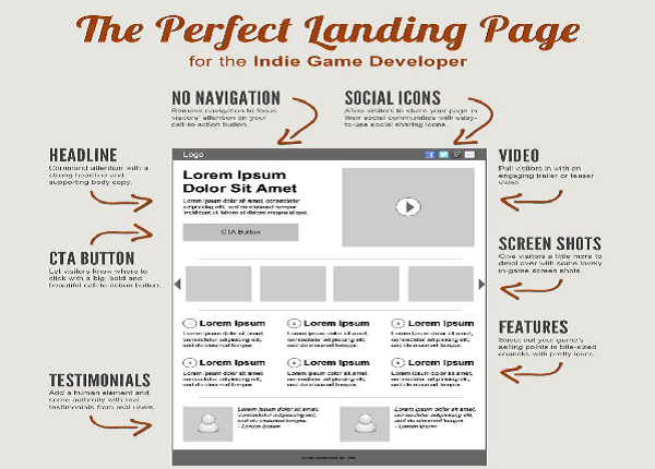
- Avoid using multiple call to actions − Be more precise use only one CTA.
- The more information that you ask the visitor, the less likely they stay. Keep your form short and simple.
- Email needs to pass the SPAM filters, you can’t write a Compelling CTA but try to use those CTA in your Landing Pages like “Buy now”, Free Download”.
- Don’t overwhelm your page with images.
- Avoid using Auto play videos as many visitors surf from their work and they have to click away from the page.
- You have 600 pixels height to be above-the-fold in most web browser resolutions, so value the CTA position and visually engage the users in 600px
- Use Easy-to-read, Easy-to-spot Bold Buttons.
- Make sure you link other pages on your main website.
- Don’t confuse users with different landing pages and different website templates. Your landing page design is to make it look as the rest of your website.
Remember that the best email landing pages keep their design and their user requirements incredibly simple!

No comments:
Post a Comment