Introduction
- The UiBinder is a framework designed to separate Functionality and View of User Interface.
- The UiBinder framework allows developers to build gwt applications as HTML pages with GWT widgets configured throughout them.
- The UiBinder framework makes easier collaboration with UI
designers who are more comfortable with XML, HTML and CSS than Java
source code
- The UIBinder provides a declarative way of defining User Interface.
- The UIBinder seperates the programmic logic from UI.
- The UIBinder is similar to what JSP is to Servlets.
UiBinder workflow
Step 1: Create UI Declaration XML File
Create a XML/HTML based User Interface declaration file. We've created a
Login.ui.xml file in our example.
<ui:UiBinder xmlns:ui='urn:ui:com.google.gwt.uibinder'
   xmlns:gwt='urn:import:com.google.gwt.user.client.ui'
   xmlns:res='urn:with:com.tutorialspoint.client.LoginResources'>
   <ui:with type="com.tutorialspoint.client.LoginResources" field="res">
   </ui:with>
   <gwt:HTMLPanel>
   ...
   </gwt:HTMLPanel>
</ui:UiBinder>
Step 2: Use ui:field for Later Binding
Use ui:field attribute in XML/HTML element to relate UI field in XML with UI field in JAVA file for later binding.
<gwt:Label ui:field="completionLabel1" />
<gwt:Label ui:field="completionLabel2" />
Step 3: Create Java counterpart of UI XML
Create Java based counterpart of XML based layout by extending Composite widget. We've created a
Login.java file in our example.
package com.tutorialspoint.client;
...
public class Login extends Composite {
...
}
Step 4: Bind Java UI fields with UiField annotation
use @UiField annotation in
Login.java to designate counterpart class members to bind to XML-based fields in
Login.ui.xml
public class Login extends Composite {
   ...
   @UiField
   Label completionLabel1;

   @UiField
   Label completionLabel2;
   ...
}
Step 5: Bind Java UI with UI XML with UiTemplate annotation
Instruct GWT to bind java based component
Login.java and XML based layout
Login.ui.xml using @UiTemplate annotation
public class Login extends Composite {

   private static LoginUiBinder uiBinder = GWT.create(LoginUiBinder.class);

   /*
   * @UiTemplate is not mandatory but allows multiple XML templates
   * to be used for the same widget.
   * Default file loaded will be <class-name>.ui.xml
   */
   @UiTemplate("Login.ui.xml")
   interface LoginUiBinder extends UiBinder<Widget, Login> {
   }
   ...
}
Step 6: Create CSS File
Create an external CSS file
Login.css and Java based Resource
LoginResources.java file equivalent to css styles
.blackText {
   font-family: Arial, Sans-serif;
   color: #000000;
   font-size: 11px;
   text-align: left;
}
...
Step 7: Create Java based Resource File for CSS File
package com.tutorialspoint.client;
...
public interface LoginResources extends ClientBundle {
   public interface MyCss extends CssResource {
      String blackText();

      ...
   }

   @Source("Login.css")
   MyCss style();
}
Step 8: Attach CSS resource in Java UI Code file.
Attach an external CSS file
Login.css using Contructor of Java based widget class
Login.java
public Login() {
   this.res = GWT.create(LoginResources.class);
   res.style().ensureInjected();
   initWidget(uiBinder.createAndBindUi(this));
}
UIBinder Complete Example
This example will take you through simple steps to show usage of a
UIBinder in GWT. Follow the following steps to update the GWT
application we created in
GWT - Create Application chapter:
| Step | Description |
|---|
| 1 | Create a project with a name HelloWorld under a package com.tutorialspoint as explained in the GWT - Create Application chapter. |
| 2 | Modify HelloWorld.gwt.xml, HelloWorld.css, HelloWorld.html and HelloWorld.java as explained below. Keep rest of the files unchanged. |
| 3 | Compile and run the application to verify the result of the implemented logic. |
Following is the content of the modified module descriptor
src/com.tutorialspoint/HelloWorld.gwt.xml.
<?xml version="1.0" encoding="UTF-8"?>
<module rename-to='helloworld'>
  <!-- Inherit the core Web Toolkit stuff.                        -->
  <inherits name='com.google.gwt.user.User'/>

  <!-- Inherit the default GWT style sheet.                       -->
  <inherits name='com.google.gwt.user.theme.clean.Clean'/>
  <!-- Inherit the UiBinder module.                               -->
  <inherits name="com.google.gwt.uibinder.UiBinder"/>
  <!-- Specify the app entry point class.                         -->
  <entry-point class='com.tutorialspoint.client.HelloWorld'/>

  <!-- Specify the paths for translatable code                    -->
  <source path='client'/>
  <source path='shared'/>

</module>
Following is the content of the modified Style Sheet file
war/HelloWorld.css.
body{
   text-align: center;
   font-family: verdana, sans-serif;
}
h1{
   font-size: 2em;
   font-weight: bold;
   color: #777777;
   margin: 40px 0px 70px;
   text-align: center;
}
Following is the content of the modified HTML host file
war/HelloWorld.html.
<html>
<head>
<title>Hello World</title>
   <link rel="stylesheet" href="HelloWorld.css"/>
   <script language="javascript" src="helloworld/helloworld.nocache.js">
   </script>
</head>
<body>

<h1>UiBinder Demonstration</h1>
<div id="gwtContainer"></div>

</body>
</html>
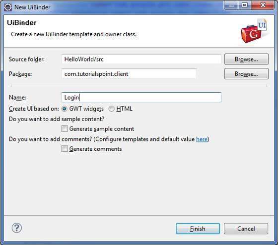
Now create a new UiBinder template and owner class (File -> New -> UiBinder).
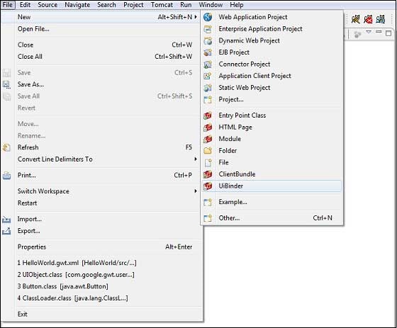
Choose the client package for the project and then name it Login.
Leave all of the other defaults.Click Finish button and the plugin will
create a new UiBinder template and owner class.
Now create Login.css file in the
src/com.tutorialspoint/client package and place the following contents in it
.blackText {
   font-family: Arial, Sans-serif;
   color: #000000;
   font-size: 11px;
   text-align: left;
}

.redText {
   font-family: Arial, Sans-serif;
   color: #ff0000;
   font-size: 11px;
   text-align: left;
}

.loginButton {
   border: 1px solid #3399DD;
   color: #FFFFFF;
   background: #555555;
   font-size: 11px;
   font-weight: bold;
   margin: 0 5px 0 0;
   padding: 4px 10px 5px;
   text-shadow: 0 -1px 0 #3399DD;
}

.box {
   border: 1px solid #AACCEE;
   display: block;
   font-size: 12px;
   margin: 0 0 5px;
   padding: 3px;
   width: 203px;
}

.background {
   background-color: #999999;
   border: 1px none transparent;
   color: #000000;
   font-size: 11px;
   margin-left: -8px;
   margin-top: 5px;
   padding: 6px;
}
Now create LoginResources.java file in the
src/com.tutorialspoint/client package and place the following contents in it
package com.tutorialspoint.client;

import com.google.gwt.resources.client.ClientBundle;
import com.google.gwt.resources.client.CssResource;

public interface LoginResources extends ClientBundle {
   /**
   * Sample CssResource.
   */
   public interface MyCss extends CssResource {
      String blackText();

      String redText();

      String loginButton();

      String box();

      String background();
   }

   @Source("Login.css")
   MyCss style();
}
Replace the contents of Login.ui.xml in
src/com.tutorialspoint/client package with the following
<ui:UiBinder xmlns:ui='urn:ui:com.google.gwt.uibinder'
   xmlns:gwt='urn:import:com.google.gwt.user.client.ui'
   xmlns:res='urn:with:com.tutorialspoint.client.LoginResources'>
   <ui:with type="com.tutorialspoint.client.LoginResources" field="res">
   </ui:with>
   <gwt:HTMLPanel>
      <div align="center">
         <gwt:VerticalPanel res:styleName="style.background">
            <gwt:Label text="Login" res:styleName="style.blackText" />
            <gwt:TextBox ui:field="loginBox" res:styleName="style.box" />
            <gwt:Label text="Password" res:styleName="style.blackText" />
            <gwt:PasswordTextBox ui:field="passwordBox"
            res:styleName="style.box" />
            <gwt:HorizontalPanel verticalAlignment="middle">
               <gwt:Button ui:field="buttonSubmit" text="Submit"
               res:styleName="style.loginButton" />
               <gwt:CheckBox ui:field="myCheckBox" />
               <gwt:Label ui:field="myLabel" text="Remember me"
               res:styleName="style.blackText" />
            </gwt:HorizontalPanel>
            <gwt:Label ui:field="completionLabel1"
            res:styleName="style.blackText" />
            <gwt:Label ui:field="completionLabel2"
            res:styleName="style.blackText" />
         </gwt:VerticalPanel>
      </div>
   </gwt:HTMLPanel>
</ui:UiBinder>
Replace the contents of Login.java in
src/com.tutorialspoint/client package with the following
package com.tutorialspoint.client;

import com.google.gwt.core.client.GWT;
import com.google.gwt.event.dom.client.ClickEvent;
import com.google.gwt.event.logical.shared.ValueChangeEvent;
import com.google.gwt.uibinder.client.UiBinder;
import com.google.gwt.uibinder.client.UiField;
import com.google.gwt.uibinder.client.UiHandler;
import com.google.gwt.uibinder.client.UiTemplate;
import com.google.gwt.user.client.Window;
import com.google.gwt.user.client.ui.Composite;
import com.google.gwt.user.client.ui.Label;
import com.google.gwt.user.client.ui.TextBox;
import com.google.gwt.user.client.ui.Widget;

public class Login extends Composite {

   private static LoginUiBinder uiBinder = GWT.create(LoginUiBinder.class);

   /*
   * @UiTemplate is not mandatory but allows multiple XML templates
   * to be used for the same widget.
   * Default file loaded will be <class-name>.ui.xml
   */
   @UiTemplate("Login.ui.xml")
   interface LoginUiBinder extends UiBinder<Widget, Login> {
   }

   @UiField(provided = true)
   final LoginResources res;

   public Login() {
      this.res = GWT.create(LoginResources.class);
      res.style().ensureInjected();
      initWidget(uiBinder.createAndBindUi(this));
   }

   @UiField
   TextBox loginBox;

   @UiField
   TextBox passwordBox;

   @UiField
   Label completionLabel1;

   @UiField
   Label completionLabel2;

   private Boolean tooShort = false;

   /*
   * Method name is not relevant, the binding is done according to the class
   * of the parameter.
   */
   @UiHandler("buttonSubmit")
   void doClickSubmit(ClickEvent event) {
      if (tooShort) {
         Window.alert("Login Successful!");
      } else {
         Window.alert("Login or Password is too short!");
      }
   }

   @UiHandler("loginBox")
   void handleLoginChange(ValueChangeEvent<String> event) {
      if (event.getValue().length() < 6) {
         completionLabel1.setText("Login too short (Size must be > 6)");
         tooShort = true;
      } else {
         tooShort = false;
         completionLabel1.setText("");
      }
   }

   @UiHandler("passwordBox")
   void handlePasswordChange(ValueChangeEvent<String> event) {
      if (event.getValue().length() < 6) {
         tooShort = true;
         completionLabel2.setText("Password too short (Size must be > 6)");
      } else {
         tooShort = false;
         completionLabel2.setText("");
      }
   }
}
Let us have following content of Java file
src/com.tutorialspoint/HelloWorld.java which will demonstrate use of UiBinder.
package com.tutorialspoint.client;

import com.google.gwt.core.client.EntryPoint;
import com.google.gwt.user.client.ui.RootPanel;

public class HelloWorld implements EntryPoint {
   public void onModuleLoad() {
      RootPanel.get().add(new Login());
   }
}
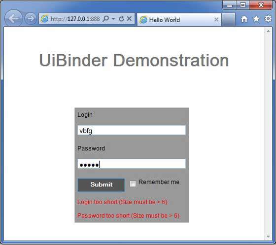
Once you are ready with all the changes done, let us compile and run the application in development mode as we did in
GWT - Create Application chapter. If everything is fine with your application, this will produce following result:

No comments:
Post a Comment