
Every user interface considers the following three main aspects:
 Every Basic UI widget inherits properties from Widget class which in
turn inherits properties from UIObject. Tree and Menu will be covered in
complex widgets tutorial.
Every Basic UI widget inherits properties from Widget class which in
turn inherits properties from UIObject. Tree and Menu will be covered in
complex widgets tutorial.
- UI elements : Thes are the core visual elements the user
eventually sees and interacts with. GWT provides a huge list of widely
used and common elements varying from basic to complex which we will
cover in this tutorial.
- Layouts: They define how UI elements should be organized on the screen and provide a final look and feel to the GUI (Graphical User Interface). This part will be covered in Layout chapter.
- Behavior: These are events which occur when the user interacts with UI elements. This part will be covered in Event Handling chapter.
GWT UI Elements:
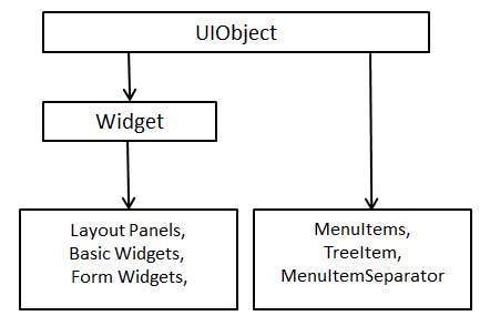
The GWT library provides classes in a well-defined class hierarchy to create complex web-based user interfaces. All classes in this component hierarchy has been derived from the UIObject base class as shown below:
Every Basic UI widget inherits properties from Widget class which in
turn inherits properties from UIObject. Tree and Menu will be covered in
complex widgets tutorial.| S.N. | Widget & Description |
|---|---|
| 1 | GWT UIObject Class This widget contains text, not interpreted as HTML using a <div>element, causing it to be displayed with block layout. |
| 2 | GWT Widget Class This widget can contain HTML text and displays the html content using a <div> element, causing it to be displayed with block layout. |
Basic Widgets
Following are few important Basic Widgets:| S.N. | Widget & Description |
|---|---|
| 1 | Label This widget contains text, not interpreted as HTML using a <div>element, causing it to be displayed with block layout. |
| 2 | HTML This widget can contain HTML text and displays the html content using a <div> element, causing it to be displayed with block layout. |
| 3 | Image This widget displays an image at a given URL. |
| 4 | Anchor This widget represents a simple <a> element. |
No comments:
Post a Comment