
Matplotlib is a plotting library for Python. It is used along with
NumPy to provide an environment that is an effective open source
alternative for MatLab. It can also be used with graphics toolkits like
PyQt and wxPython.
Matplotlib module was first written by John D. Hunter. Since 2012, Michael Droettboom is the principal developer. Currently, Matplotlib ver. 1.5.1 is the stable version available. The package is available in binary distribution as well as in the source code form on www.matplotlib.org.
Conventionally, the package is imported into the Python script by adding the following statement −
The graphical representation is displayed by show() function.
The above code should produce the following output −
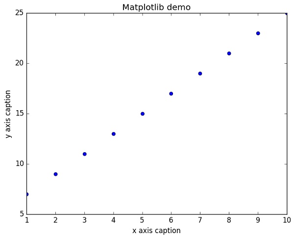
 Instead of the linear graph, the values can be displayed discretely by adding a format string to the plot() function. Following formatting characters can be used.
The following color abbreviations are also defined.
To display the circles representing points, instead of the line in the above example, use “ob” as the format string in plot() function.
Matplotlib module was first written by John D. Hunter. Since 2012, Michael Droettboom is the principal developer. Currently, Matplotlib ver. 1.5.1 is the stable version available. The package is available in binary distribution as well as in the source code form on www.matplotlib.org.
Conventionally, the package is imported into the Python script by adding the following statement −
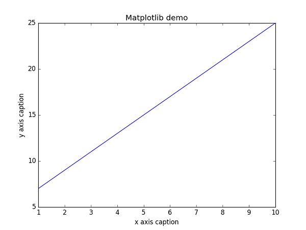
from matplotlib import pyplot as pltHere pyplot() is the most important function in matplotlib library, which is used to plot 2D data. The following script plots the equation y = 2x + 5
Example
import numpy as np
from matplotlib import pyplot as plt

x = np.arange(1,11)
y = 2 * x + 5
plt.title("Matplotlib demo")
plt.xlabel("x axis caption")
plt.ylabel("y axis caption")
plt.plot(x,y)
plt.show()
An ndarray object x is created from np.arange() function as the values on the x axis. The corresponding values on the y axis are stored in another ndarray object y. These values are plotted using plot() function of pyplot submodule of matplotlib package.
The graphical representation is displayed by show() function.
The above code should produce the following output −
Instead of the linear graph, the values can be displayed discretely by adding a format string to the plot() function. Following formatting characters can be used.| Character | Description |
|---|---|
| '-' | Solid line style |
| '--' | Dashed line style |
| '-.' | Dash-dot line style |
| ':' | Dotted line style |
| '.' | Point marker |
| ',' | Pixel marker |
| 'o' | Circle marker |
| 'v' | Triangle_down marker |
| '^' | Triangle_up marker |
| '<' | Triangle_left marker |
| '>' | Triangle_right marker |
| '1' | Tri_down marker |
| '2' | Tri_up marker |
| '3' | Tri_left marker |
| '4' | Tri_right marker |
| 's' | Square marker |
| 'p' | Pentagon marker |
| '*' | Star marker |
| 'h' | Hexagon1 marker |
| 'H' | Hexagon2 marker |
| '+' | Plus marker |
| 'x' | X marker |
| 'D' | Diamond marker |
| 'd' | Thin_diamond marker |
| '|' | Vline marker |
| '_' | Hline marker |
| Character | Color |
|---|---|
| 'b' | Blue |
| 'g' | Green |
| 'r' | Red |
| 'c' | Cyan |
| 'm' | Magenta |
| 'y' | Yellow |
| 'k' | Black |
| 'w' | White |
Example
import numpy as np
from matplotlib import pyplot as plt

x = np.arange(1,11)
y = 2 * x + 5
plt.title("Matplotlib demo")
plt.xlabel("x axis caption")
plt.ylabel("y axis caption")
plt.plot(x,y,"ob")
plt.show()
The above code should produce the following output −
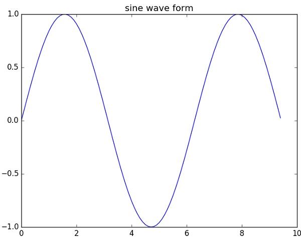
Sine Wave Plot
The following script produces the sine wave plot using matplotlib.Example
import numpy as np
import matplotlib.pyplot as plt

# Compute the x and y coordinates for points on a sine curve
x = np.arange(0, 3 * np.pi, 0.1)
y = np.sin(x)
plt.title("sine wave form")

# Plot the points using matplotlib
plt.plot(x, y)
plt.show()
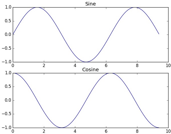
subplot()
The subplot() function allows you to plot different things in the same figure. In the following script, sine and cosine values are plotted.Example
import numpy as np
import matplotlib.pyplot as plt

# Compute the x and y coordinates for points on sine and cosine curves
x = np.arange(0, 3 * np.pi, 0.1)
y_sin = np.sin(x)
y_cos = np.cos(x)

# Set up a subplot grid that has height 2 and width 1,
# and set the first such subplot as active.
plt.subplot(2, 1, 1)

# Make the first plot
plt.plot(x, y_sin)
plt.title('Sine')

# Set the second subplot as active, and make the second plot.
plt.subplot(2, 1, 2)
plt.plot(x, y_cos)
plt.title('Cosine')

# Show the figure.
plt.show()
The above code should produce the following output −
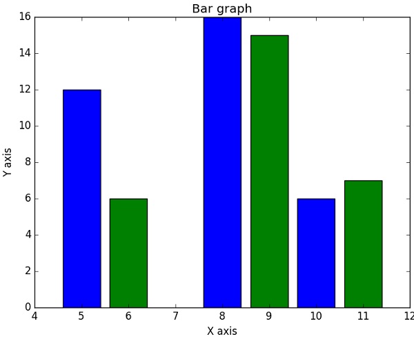
bar()
The pyplot submodule provides bar() function to generate bar graphs. The following example produces the bar graph of two sets of x and y arrays.Example
from matplotlib import pyplot as plt
x = [5,8,10]
y = [12,16,6]

x2 = [6,9,11]
y2 = [6,15,7]
plt.bar(x, y, align = 'center')
plt.bar(x2, y2, color = 'g', align = 'center')
plt.title('Bar graph')
plt.ylabel('Y axis')
plt.xlabel('X axis')

plt.show()
This code should produce the following output −
No comments:
Post a Comment