পৃষ্ঠাসমূহ

Search Your Article

CS


Welcome to GoogleDG – your one-stop destination for free learning resources, guides, and digital tools.

At GoogleDG, we believe that knowledge should be accessible to everyone. Our mission is to provide readers with valuable ebooks, tutorials, and tech-related content that makes learning easier, faster, and more enjoyable.

What We Offer:

  • 📘 Free & Helpful Ebooks – covering education, technology, self-development, and more.

  • 💻 Step-by-Step Tutorials – practical guides on digital tools, apps, and software.

  • 🌐 Tech Updates & Tips – simplified information to keep you informed in the fast-changing digital world.

  • 🎯 Learning Support – resources designed to support students, professionals, and lifelong learners.

    Latest world News 


Our Vision

To create a digital knowledge hub where anyone, from beginners to advanced learners, can find trustworthy resources and grow their skills.

Why Choose Us?

✔ Simple explanations of complex topics
✔ 100% free access to resources
✔ Regularly updated content
✔ A community that values knowledge sharing

We are continuously working to expand our content library and provide readers with the most useful and relevant digital learning materials.

📩 If you’d like to connect, share feedback, or suggest topics, feel free to reach us through the Contact page.

Pageviews

Friday, March 24, 2017

NumPy - Histogram Using Matplotlib

NumPy has a numpy.histogram() function that is a graphical representation of the frequency distribution of data. Rectangles of equal horizontal size corresponding to class interval called bin and variable height corresponding to frequency.

numpy.histogram()

The numpy.histogram() function takes the input array and bins as two parameters. The successive elements in bin array act as the boundary of each bin.
import numpy as np 
   
a = np.array([22,87,5,43,56,73,55,54,11,20,51,5,79,31,27]) 
np.histogram(a,bins = [0,20,40,60,80,100]) 
hist,bins = np.histogram(a,bins = [0,20,40,60,80,100]) 
print hist 
print bins 
It will produce the following output −
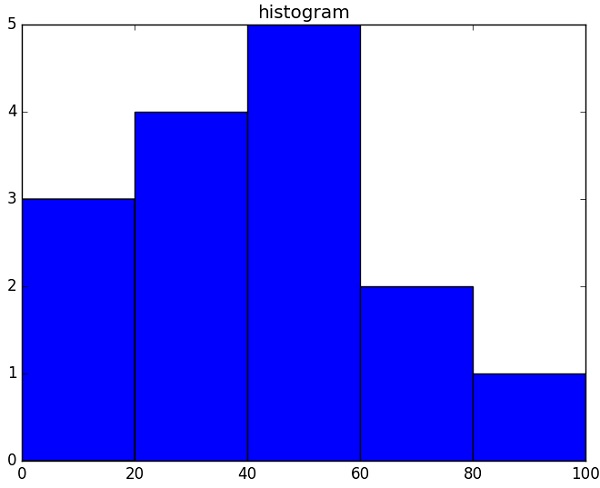
[3 4 5 2 1]
[0 20 40 60 80 100]

plt()

Matplotlib can convert this numeric representation of histogram into a graph. The plt() function of pyplot submodule takes the array containing the data and bin array as parameters and converts into a histogram.
from matplotlib import pyplot as plt 
import numpy as np  
   
a = np.array([22,87,5,43,56,73,55,54,11,20,51,5,79,31,27]) 
plt.hist(a, bins = [0,20,40,60,80,100]) 
plt.title("histogram") 
plt.show()
It should produce the following output −
Histogram Plot

No comments:

Post a Comment