
SASS helps to make the code more flexible and customizable in the Foundation.
We have installed Foundation using npm, hence you can find setting file included under your_folder_name/node_modules/foundation-sites/scss/settings/_settings.scss. You can move this into your own Sass files to work with.
You can write your own CSS, if you're not able to customize with variables. Below is a set of variables, which change the default styling of buttons.
Compatibility
To install SASS based version for foundation, Ruby has to be installed on Windows. Foundation can be compiled with Ruby Sass and libsass. We recommended node-sass 3.4.2+ version to compile SASS.Autoprefixer Required
Autoprefixer handle the SASS files. gulp-autoprefixer is used to build the process. Following autoprefixer setting is used to get proper browser support.autoprefixer({ browsers: ['last 2 versions', 'ie >= 9', 'and_chr >= 2.3'] });
Loading the Framework
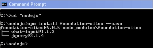
We can install the framework files using NPM. Using command line interface (CLI), we can compile the Sass files. Following is the command to load the framework:npm install foundation-sites --saveAfter running the above command line code, you will get the following lines as shown below:
Compiling Manually
Framework files can be added as an import path depending upon on your build process, but the path will be same packages_folder/foundation-sites/scss. The @import statement is included at the top of the foundation-sites.scss file. The next line in the given code is explained in the Adjusting CSS Output section.@import 'foundation'; @include foundation-everything;
Using Compiled CSS
You can include the pre-compiled CSS files. There are two types of CSS files, i.e. minified and unminified. Minified version is used for production and the unminified version is used to directly edit the framework CSS.<link rel="stylesheet" href="node_modules/foundation-sites/dist/foundation-sites.css"> <link rel="stylesheet" href="node_modules/foundation-sites/dist/foundation-sites.min.css">
Adjusting CSS Output
For various components, Foundation output consist many classes. It is used to control the CSS output of the framework. Add the below single line of code to include all the components at once.@include foundation-everything;Following are the list of the components imported when you write the above code in our scss file. The components which are not necessary can be commented. You can view the below code lines in the Your_folder_name/node_modules/foundation-sites/scss/foundation.scss file.
@import 'foundation';

@import 'grid/grid';
@import 'typography/typography';
@import 'forms/forms';
@import 'components/visibility';
@import 'components/float';
@import 'components/button';
@import 'components/button-group';
@import 'components/accordion-menu';
@import 'components/accordion';
@import 'components/badge';
@import 'components/breadcrumbs';
@import 'components/callout';
@import 'components/close-button';
@import 'components/drilldown';
...
...
...
//so on....
The Settings File
A settings file is included in the entire foundation project i.e. _settings.scss. If you're using Yeti Launch or the CLI to create a Foundation for Sites project, you can find the settings file under src/assets/scss/.We have installed Foundation using npm, hence you can find setting file included under your_folder_name/node_modules/foundation-sites/scss/settings/_settings.scss. You can move this into your own Sass files to work with.
You can write your own CSS, if you're not able to customize with variables. Below is a set of variables, which change the default styling of buttons.
$button-padding: 0.85em 1em;
$button-margin: 0 $global-margin $global-margin 0;
$button-fill: solid;
$button-background: $primary-color;
$button-background-hover: scale-color($button-background, $lightness: -15%);
$button-color: #fff;
$button-color-alt: #000;
$button-radius: $global-radius;
$button-sizes: (
  tiny: 0.6rem,
  small: 0.75rem,
  default: 0.9rem,
  large: 1.25rem,
);
$button-opacity-disabled: 0.25;
No comments:
Post a Comment