Flex provides two ways to create custom components.
- Using ActionScript
- Using MXML
Using ActionScript
You can create a component by extending existing component. To create a component using Flash Builder, Click on
File > New > ActionScript Class. Enter the details as shown below.
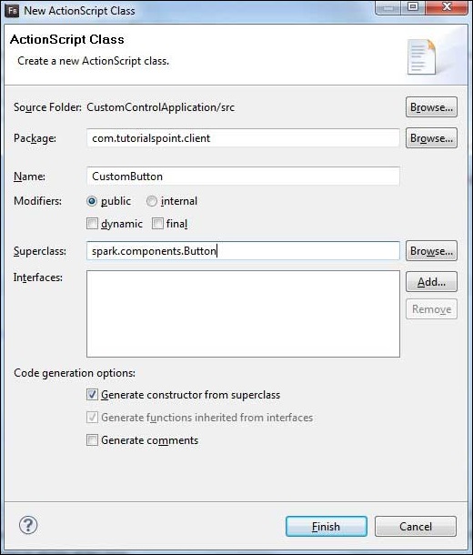
Flash Builder will create the following CustomButton.as file.
package com.tutorialspoint.client
{
   import spark.components.Button;

   public class CustomButton extends Button
   {
      public function CustomButton()
      {
         super();
      }
   }
}
Using MXML
You can create a component by extending existing component. To create a component using Flash Builder, Click on
File > New > MXML Component. Enter the details as shown below.
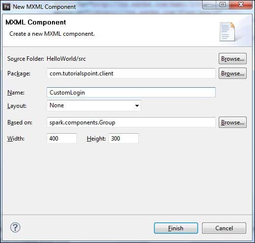
Flash Builder will create the following CustomLogin.mxml file.
<?xml version="1.0" encoding="utf-8"?>
<s:Group xmlns:fx="http://ns.adobe.com/mxml/2009"
   xmlns:s="library://ns.adobe.com/flex/spark"
   xmlns:mx="library://ns.adobe.com/flex/mx"
   width="400" height="300">

</s:Group>
Let us follow the following steps to test custom controls in a Flex application:
| Step | Description |
|---|
| 1 | Create a project with a name HelloWorld under a package com.tutorialspoint.client as explained in the Flex - Create Application chapter. |
| 2 | Modify HelloWorld.mxml as explained below. Keep rest of the files unchanged. |
| 4 | Create CustomLogin.mxml and CustomButton.as component as explained above. Modify these files as explained below. Keep rest of the files unchanged. |
| 3 | Compile and run the application to make sure business logic is working as per the requirements. |
Following is the content of the modified mxml file
src/com.tutorialspoint/client/CustomLogin.mxml.
<?xml version="1.0" encoding="utf-8"?>
<s:Group xmlns:fx="http://ns.adobe.com/mxml/2009"
   xmlns:s="library://ns.adobe.com/flex/spark"
   xmlns:mx="library://ns.adobe.com/flex/mx" width="400" height="300">
   <s:Form>
      <s:FormItem label="UserName:">
         <s:TextInput width="200" />
      </s:FormItem>
      <s:FormItem label="Password:">
         <s:TextInput width="200"
            displayAsPassword="true" />
      </s:FormItem>
      <s:FormItem>
         <s:Button label="Login" />
      </s:FormItem>
   </s:Form>
</s:Group>
Following is the content of the modified mxml file
src/com.tutorialspoint/client/CustomButton.as.
package com.tutorialspoint.client
{
   import spark.components.Button;

   public class CustomButton extends Button
   {
      public function CustomButton()
      {
         super();
         this.setStyle("color","green");
         this.label = "Submit";
      }
   }
}
Following is the content of the modified mxml file
src/com.tutorialspoint/client/HelloWorld.mxml.
<?xml version="1.0" encoding="utf-8"?>
<s:Application xmlns:fx="http://ns.adobe.com/mxml/2009"
   xmlns:s="library://ns.adobe.com/flex/spark"
   xmlns:mx="library://ns.adobe.com/flex/mx"
   xmlns:client="com.tutorialspoint.client.*"
   initialize="application_initializeHandler(event)"
   >
   <fx:Style source="/com/tutorialspoint/client/Style.css"/>
   <fx:Script>
      <![CDATA[
        import mx.events.FlexEvent;

        protected function application_initializeHandler(event:FlexEvent):void
        {
           //create a new custom button
           var customButton: CustomButton = new CustomButton();
           asPanel.addElement(customButton);
        }

      ]]>
   </fx:Script>
   <s:BorderContainer width="630" height="480" id="mainContainer"
      styleName="container">
      <s:VGroup width="100%" height="100%" gap="10"
         horizontalAlign="center" verticalAlign="middle">
         <s:Label id="lblHeader" text="Custom Controls Demonstration"
            fontSize="40" color="0x777777" styleName="heading"/>

         <s:Panel title="Using MXML Component" width="400" height="200">
            <client:CustomLogin>
            </client:CustomLogin>
         </s:Panel>
         <s:Panel  title="Using AS Component" width="400" height="100">
            <s:VGroup id="asPanel" width="100%" height="100%" gap="10"
               horizontalAlign="center" verticalAlign="middle">
            </s:VGroup>
         </s:Panel>
      </s:VGroup>
   </s:BorderContainer>
</s:Application>
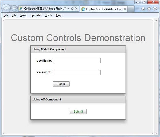
Once you are ready with all the changes done, let us compile and run the application in normal mode as we did in
Flex - Create Application chapter. If everything is fine with your application, this will produce following result: [
Try it online ]
 Flash Builder will create the following CustomButton.as file.
 Flash Builder will create the following CustomLogin.mxml file.
 Flash Builder will create the following CustomButton.as file.
 Flash Builder will create the following CustomLogin.mxml file.

No comments:
Post a Comment