GWT provides three ways to create custom user interface elements. There are three general strategies to follow:
Here we are going to create a custom widget by extending Composite class, which is the easiest way to build custom widgets.
Following is the content of the modified module descriptor src/com.tutorialspoint/HelloWorld.gwt.xml.
 You can notice following points
- Create a widget by extending Composite Class: This is the
most common and easiest way to create custom widgets. Here you can use
existing widgets to create composite view with custom properties.
- Create a widget using GWT DOM API in JAVA: GWT basic widgets are created in this way. Still its a very complicated way to create custom widget and should be used cautiously.
- Use JavaScript and wrap it in a widget using JSNI: This should generally only be done as a last resort. Considering the cross-browser implications of the native methods, it becomes very complicated and also becomes more difficult to debug.
Create Custom Widget with Composite Class
This example will take you through simple steps to show creation of a Custom Widget in GWT. Follow the following steps to update the GWT application we created in GWT - Basic Widgets chapter:Here we are going to create a custom widget by extending Composite class, which is the easiest way to build custom widgets.
| Step | Description |
|---|---|
| 1 | Create a project with a name HelloWorld under a package com.tutorialspoint as explained in the GWT - Create Application chapter. |
| 2 | Modify HelloWorld.gwt.xml, HelloWorld.css, HelloWorld.html and HelloWorld.java as explained below. Keep rest of the files unchanged. |
| 3 | Compile and run the application to verify the result of the implemented logic. |
<?xml version="1.0" encoding="UTF-8"?>
<module rename-to='helloworld'>
  <!-- Inherit the core Web Toolkit stuff.                        -->
  <inherits name='com.google.gwt.user.User'/>

  <!-- Inherit the default GWT style sheet.                       -->
  <inherits name='com.google.gwt.user.theme.clean.Clean'/>

  <!-- Specify the app entry point class.                         -->
  <entry-point class='com.tutorialspoint.client.HelloWorld'/>

  <!-- Specify the paths for translatable code                    -->
  <source path='client'/>
  <source path='shared'/>

</module>
Following is the content of the modified Style Sheet file war/HelloWorld.css.
body{
   text-align: center;
   font-family: verdana, sans-serif;
}
h1{
   font-size: 2em;
   font-weight: bold;
   color: #777777;
   margin: 40px 0px 70px;
   text-align: center;
}
Following is the content of the modified HTML host file war/HelloWorld.html.
<html>
<head>
<title>Hello World</title>
   <link rel="stylesheet" href="HelloWorld.css"/>
   <script language="javascript" src="helloworld/helloworld.nocache.js">
   </script>
</head>
<body>

<h1>Custom Widget Demonstration</h1>
<div id="gwtContainer"></div>

</body>
</html>
Let us have following content of Java file src/com.tutorialspoint/HelloWorld.java which will demonstrate creation of a Custom widget.
package com.tutorialspoint.client;

import com.google.gwt.core.client.EntryPoint;
import com.google.gwt.event.dom.client.ClickEvent;
import com.google.gwt.event.dom.client.ClickHandler;
import com.google.gwt.user.client.ui.CheckBox;
import com.google.gwt.user.client.ui.Composite;
import com.google.gwt.user.client.ui.HorizontalPanel;
import com.google.gwt.user.client.ui.RootPanel;
import com.google.gwt.user.client.ui.TextBox;

public class HelloWorld implements EntryPoint {

   /**
   * A composite of a TextBox and a CheckBox that optionally enables it.
   */
   private static class OptionalTextBox extends Composite implements
   ClickHandler {

      private TextBox textBox = new TextBox();
      private CheckBox checkBox = new CheckBox();
      private boolean enabled = true;

      public boolean isEnabled() {
         return enabled;
      }

      public void setEnabled(boolean enabled) {
         this.enabled = enabled;
      }

      /**
      * Style this widget using .optionalTextWidget CSS class.<br/>
      * Style textbox using .optionalTextBox CSS class.<br/>
      * Style checkbox using .optionalCheckBox CSS class.<br/>
      * Constructs an OptionalTextBox with the given caption
      * on the check.
      * @param caption the caption to be displayed with the check box
      */
      public OptionalTextBox(String caption) {
         // place the check above the text box using a vertical panel.
         HorizontalPanel panel = new HorizontalPanel();
         // panel.setBorderWidth(1);
         panel.setSpacing(10);
         panel.add(checkBox);
         panel.add(textBox);

         // all composites must call initWidget() in their constructors.
         initWidget(panel);

         //set style name for entire widget
         setStyleName("optionalTextWidget");

         //set style name for text box
         textBox.setStyleName("optionalTextBox");

         //set style name for check box
         checkBox.setStyleName("optionalCheckBox");
         textBox.setWidth("200");

         // Set the check box's caption, and check it by default.
         checkBox.setText(caption);
         checkBox.setValue(enabled);
         checkBox.addClickHandler(this);
         enableTextBox(enabled,checkBox.getValue());
      }

      public void onClick(ClickEvent event) {
         if (event.getSource() == checkBox) {
            // When the check box is clicked,
            //update the text box's enabled state.
            enableTextBox(enabled,checkBox.getValue());
         }
      }

      private void enableTextBox(boolean enable,boolean isChecked){
         enable = (enable && isChecked) || (!enable && !isChecked);
         textBox.setStyleDependentName("disabled", !enable);
         textBox.setEnabled(enable);
      }
   }

   public void onModuleLoad() {
      // Create an optional text box and add it to the root panel.
      OptionalTextBox otb = new OptionalTextBox(
      "Want to explain the solution?");
      otb.setEnabled(true);
      RootPanel.get().add(otb);
   }
}
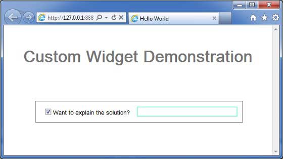
Once you are ready with all the changes done, let us compile and run the application in development mode as we did in GWT - Create Application chapter. If everything is fine with your application, this will produce following result:
 You can notice following points
- Creation of Custom Widget by extending Composite widget is pretty easy.
- We've created a widget with GWT inbuilt widgets, TextBox and CheckBox thus using the concept of reusability.
- TextBox get disabled/enabled depending on state of checkbox. We've provided an API to enable/disable the control.
- We've exposed internal widgets styles via documented CSS styles.

No comments:
Post a Comment