
Introduction:
The standard graphical user interface (GUI) for Ruby is Tk. Tk started out as the GUI for the Tcl scripting language developed by John Ousterhout.Tk has the unique distinction of being the only cross-platform GUI. Tk runs on Windows, Mac, and Linux and provides a native look-and-feel on each operating system.
The basic component of a Tk-based application is called a widget. A component is also sometimes called a window, since, in Tk, "window" and "widget" are often used interchangeably.
Tk applications follow a widget hierarchy where any number of widgets may be placed within another widget, and those widgets within another widget, ad infinitum. The main widget in a Tk program is referred to as the root widget and can be created by making a new instance of the TkRoot class.
- Most Tk-based applications follow the same cycle: create the widgets, place them in the interface, and finally, bind the events associated with each widget to a method.
- There are three geometry managers; place, grid and pack that are responsible for controlling the size and location of each of the widgets in the interface.
Installation:
The Ruby Tk bindings are distributed with Ruby but Tk is a separate installation. Windows users can download a single click Tk installation from ActiveState's ActiveTcl.Mac and Linux users may not need to install it because there is a great chance that its already installed along with OS but if not, you can download prebuilt packages or get the source from the Tcl Developer Xchange.
Simple Tk Application:
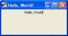
A typical structure for Ruby/Tk programs is to create the main or root window (an instance of TkRoot), add widgets to it to build up the user interface, and then start the main event loop by calling Tk.mainloop.The traditional Hello, World! example for Ruby/Tk looks something like this:
require 'tk'

root = TkRoot.new { title "Hello, World!" }
TkLabel.new(root) do
   text 'Hello, World!'
   pack { padx 15 ; pady 15; side 'left' }
end
Tk.mainloop
Here, after loading the tk extension module, we create a root-level frame using TkRoot.new. We then make a TkLabel widget as a child of the root frame, setting several options for the label. Finally, we pack the root frame and enter the main GUI event loop.
If you would run this script, it would produce the following result:
Ruby/Tk Widget Classes:
There is a list of various Ruby/Tk classes, which can be used to create a desired GUI using Ruby/Tk.- TkFrame Create and manipulate frame widgets
- TkButton Create and manipulate button widgets
- TkLabel Create and manipulate label widgets
- TkEntry Create and manipulate entry widgets
- TkCheckButton Create and manipulate checkbutton widgets
- TkRadioButton Create and manipulate radiobutton widgets
- TkListbox Create and manipulate listbox widgets
- TkComboBox Create and manipulate listbox widgets
- TkMenu Create and manipulate menu widgets
- TkMenubutton Create and manipulate menubutton widgets
- Tk.messageBox Create and manipulate a message dialog
- TkScrollbar Create and manipulate scrollbar widgets
- TkCanvas Create and manipulate canvas widgets
- TkScale Create and manipulate scale widgets
- TkText Create and manipulate text widgets
- TkToplevel Create and manipulate toplevel widgets
- TkSpinbox Create and manipulate Spinbox widgets
- TkProgressBar Create and manipulate Progress Bar widgets
- Dialog Box Create and manipulate Dialog Box widgets
- Tk::Tile::Notebook Display several windows in limited space with notebook metaphor.
- Tk::Tile::Paned Displays a number of subwindows, stacked either vertically or horizontally.
- Tk::Tile::Separator Displays a horizontal or vertical separator bar.
- Ruby/Tk Font, Colors and Images Understanding Ruby/Tk Fonts, Colors and Images
Standard Configuration Options:
All widgets have a number of different configuration options, which generally control how they are displayed or how they behave. The options that are available depend upon the widget class of course.Here is a list of all the standard configuration options which could be applicable to any Ruby/Tk widget. There are other widget specific options also which would be explained along with widgets.
| SN | Options with Description |
|---|---|
| 1 | activebackground => StringSpecifies background color to use when drawing active elements. An element is active if the mouse cursor is positioned over the element and pressing a mouse button will cause some action to occur. You can use color names like "red", "blue", "pink", "yellow" etc. |
| 2 | activeborderwidth => IntegerSpecifies a non-negative value indicating the width of the 3-D border drawn around active elements. |
| 3 | activeforeground => StringSpecifies foreground color to use when drawing active elements. |
| 4 | anchor => StringSpecifies how the information in a widget (e.g. text or a bitmap) is to be displayed in the widget. Must be one of the values n, ne, e, se, s, sw, w, nw, or center. For example, nw means display the information such that its top-left corner is at the top-left corner of the widget. |
| 5 | background or bg => StringSpecifies the normal background color to use when displaying the widget. |
| 6 | bitmap => BitmapSpecifies a bitmap to display in the widget. The exact way in which the bitmap is displayed may be affected by other options such as anchor or justify. |
| 7 | borderwidth or bd => IntegerSpecifies a non-negative value indicating the width of the 3-D border to draw around the outside of the widget. |
| 8 | compound => StringSpecifies if the widget should display text and bitmaps/images at the same time, and if so, where the bitmap/image should be placed relative to the text. Must be one of the values none, bottom, top, left, right, or center. |
| 9 | cursor => StringSpecifies the mouse cursor to be used for the widget. Possible values could be "watch", "arrow" etc. |
| 10 | disabledforeground => StringSpecifies foreground color to use when drawing a disabled element. |
| 11 | exportselection => BooleanSpecifies whether or not a selection in the widget should also be the X selection. The value may have any of the true, false, 0, 1, yes, or no. If the selection is exported, then selecting in the widget deselects the current X selection, selecting outside the widget deselects any widget selection, and the widget will respond to selection retrieval requests when it has a selection. |
| 12 | font => StringSpecifies the font to use when drawing text inside the widget. |
| 13 | foreground or fg => StringSpecifies the normal foreground color to use when displaying the widget. |
| 14 | highlightbackground => StringSpecifies the color to display in the traversal highlight region when the widget does not have the input focus. |
| 15 | highlightcolor => StringSpecifies the color to use for the traversal highlight rectangle that is drawn around the widget when it has the input focus. |
| 16 | highlightthickness => IntegerSpecifies a non-negative value indicating the width of the highlight rectangle to draw around the outside of the widget when it has the input focus. |
| 17 | image => ImageSpecifies an image to display in the widget, which must have been created with an image create. Typically, if the image option is specified then it overrides other options that specify a bitmap or textual value to display in the widget; the image option may be reset to an empty string to re-enable a bitmap or text display. |
| 18 | jump => StringFor widgets with a slider that can be dragged to adjust a value, such as scrollbars and scales, this option determines when notifications are made about changes in the value. The option's value must be a boolean. If the value is false, updates are made continuously as the slider is dragged. If the value is true, updates are delayed until the mouse button is released to end the drag; at that point a single notification is made. |
| 19 | justify => StringWhen there are multiple lines of text displayed in a widget, this option determines how the lines line up with each other. Must be one of left, center, or right. Left means that the lines' left edges all line up, center means that the lines' centers are aligned, and right means that the lines' right edges line up. |
| 20 | offset => StringSpecifies the offset of tiles (see also tile option). It can have two different formats offset x,y or offset side, where side can be n, ne, e, se, s, sw, w, nw, or center. |
| 21 | orient => StringFor widgets that can lay themselves out with either a horizontal or vertical orientation, such as scrollbars, this option specifies which orientation should be used. Must be either horizontal or vertical or an abbreviation of one of these. |
| 22 | padx => IntegerSpecifies a non-negative value indicating how much extra space to request for the widget in the X-direction. |
| 23 | pady => IntegerSpecifies a non-negative value indicating how much extra space to request for the widget in the Y-direction. |
| 24 | relief => IntegerSpecifies the 3-D effect desired for the widget. Acceptable values are raised, sunken, flat, ridge, and groove. |
| 25 | repeatdelay => IntegerSpecifies the number of milliseconds a button or key must be held down before it begins to auto-repeat. Used, for example, on the up- and down-arrows in scrollbars. |
| 26 | repeatinterval => IntegerUsed in conjunction with repeatdelay: once auto-repeat begins, this option determines the number of milliseconds between auto-repeats. |
| 27 | selectbackground => StringSpecifies the background color to use when displaying selected items. |
| 28 | selectborderwidth => IntegerSpecifies a non-negative value indicating the width of the 3-D border to draw around selected items. |
| 29 | selectforeground => StringSpecifies the foreground color to use when displaying selected items. |
| 30 | setgrid => BooleanSpecifies a boolean value that determines whether this widget controls the resizing grid for its top-level window. This option is typically used in text widgets, where the information in the widget has a natural size (the size of a character) and it makes sense for the window's dimensions to be integral numbers of these units. |
| 31 | takefocus => IntegerProvides information used when moving the focus from window to window via keyboard traversal (e.g., Tab and Shift-Tab). Before setting the focus to a window, the traversal scripts first check whether the window is viewable (it and all its ancestors are mapped); if not, the window is skipped. A value of 0 means that this window should be skipped entirely during keyboard traversal. 1 means that the this window should always receive the input focus. |
| 32 | text => StringSpecifies a string to be displayed inside the widget. The way in which the string is displayed depends on the particular widget and may be determined by other options, such as anchor or justify. |
| 33 | textvariable => VariableSpecifies the name of a variable. The value of the variable is a text string to be displayed inside the widget; if the variable value changes then the widget will automatically update itself to reflect the new value. The way in which the string is displayed in the widget depends on the particular widget and may be determined by other options, such as anchor or justify. |
| 34 | tile => ImageSpecifies image used to display the widget. If image is the empty string, then the normal background color is displayed. |
| 35 | troughcolor => StringSpecifies the color to use for the rectangular trough areas in widgets such as scrollbars and scales. |
| 36 | troughtile => ImageSpecifies image used to display in the rectangular trough areas in widgets such as scrollbars and scales. |
| 37 | underline => IntegerSpecifies the integer index of a character to underline in the widget. This option is used by the default bindings to implement keyboard traversal for menu buttons and menu entries. 0 corresponds to the first character of the text displayed in the widget, 1 to the next character, and so on. |
| 38 | wraplength => IntegerFor widgets that can perform word-wrapping, this option specifies the maximum line length. |
| 39 | xscrollcommand => functionSpecifies a callback used to communicate with horizontal scrollbars. |
| 40 | yscrollcommand => functionSpecifies a callback used to communicate with vertical scrollbars. |
Ruby/Tk Geometry Management:
Geometry Management deals with positioning different widgets as per requirement. Geometry management in Tk relies on the concept of master and slave widgets.A master is a widget, typically a top-level window or a frame, which will contain other widgets, which are called slaves. You can think of a geometry manager as taking control of the master widget, and deciding what will be displayed within.
The geometry manager will ask each slave widget for its natural size, or how large it would ideally like to be displayed. It then takes that information and combines it with any parameters provided by the program when it asks the geometry manager to manage that particular slave widget.
There are three geometry managers place, grid and pack that are responsible for controlling the size and location of each of the widgets in the interface.
- grid Geometry manager that arranges widgets in a grid
- pack Geometry manager that packs around edges of cavity
- place Geometry manager for fixed or rubber-sheet placement
Ruby/Tk Event Handling:
Ruby/Tk supports event loop which receives events from the operating system. These are things like button presses, keystrokes, mouse movement, window resizing, and so on.Ruby/Tk takes care of managing this event loop for you. It will figure out what widget the event applies to (did the user click on this button? if a key was pressed, which textbox had the focus?), and dispatch it accordingly. Individual widgets know how to respond to events, so for example a button might change color when the mouse moves over it, and revert back when the mouse leaves.
At a higher level, Ruby/Tk invokes callbacks in your program to indicate that something significant happened to a widget For either case, you can provide a code block or a Ruby Proc object that specifies how the application responds to the event or callback.
Let's take a look at how to use the bind method to associate basic window system events with the Ruby procedures that handle them. The simplest form of bind takes as its inputs a string indicating the event name and a code block that Tk uses to handle the event.
For example, to catch the ButtonRelease event for the first mouse button on some widget, you'd write:
someWidget.bind('ButtonRelease-1') {
    ....code block to handle this event...
}
An event name can include additional modifiers and details. A modifier is a string like Shift, Control or Alt, indicating that one of the modifier keys was pressed.
So, for example, to catch the event that's generated when the user holds down the Ctrl key and clicks the right mouse button
someWidget.bind('Control-ButtonPress-3', proc { puts "Ouch!" })Many Ruby/Tk widgets can trigger callbacks when the user activates them, and you can use the command callback to specify that a certain code block or procedure is invoked when that happens. As seen earlier, you can specify the command callback procedure when you create the widget:
helpButton = TkButton.new(buttonFrame) {
   text "Help"
   command proc { showHelp }
}
or you can assign it later, using the widget's command method:
helpButton.command proc { showHelp }Since the command method accepts either procedures or code blocks, you could also write the previous code example as:
helpButton = TkButton.new(buttonFrame) {
   text "Help"
   command { showHelp }
}
There are following basic event types, which you can use in your Ruby/Tk application:
| Tag | Event Description |
|---|---|
| "1" (one) | Clicked left mouse button |
| "ButtonPress-1" | Clicked left mouse button |
| "Enter" | Moved mouse inside |
| "Leave" | Moved mouse outside |
| "Double-1" | Double clicked |
| "B3-Motion" | Right button drag from one position to another |
| Control-ButtonPress-3 | Right button is pressed along with Ctrl Key. |
| Alt-ButtonPress-1 | Let button is pressed along with Alt Key. |
The configure Method
The configure method can be used to set and retrieve any widget configuration values. For example, to change the width of a button you can call configure method any time as follows:require "tk" button = TkButton.new { text 'Hello World!' pack } button.configure('activebackground', 'blue') Tk.mainloopTo get the value for a current widget, just supply it without a value as follows:
color = button.configure('activebackground')You can also call configure without any options at all, which will give you a listing of all options and their values.
The cget Method:
For simply retrieving the value of an option, configure returns more information than you generally want. The cget method returns just the current value.color = button.cget('activebackground')
No comments:
Post a Comment